This project was created in 2020 for a group of lawyers who give online advice to other professionals in criminology and criminal law. Using Instagram as the main communication channel, the group offers specialized support through mentoring, courses, and e-books.
The Goal
Redesign the brand to give it a more serious look in order to generate more credibility, authority, and professionalism.
The Solution
The symbol of Juris Consultt was created based on the initials of its name, as requested in the briefing. My idea was to form a pair of handcuffs, emphasizing criminal law, criminal procedure, and criminology.
With the concept already defined, I used grids, a design technique, to refine the lines. This technique uses geometry to align and harmonize the drawn elements, aiming to make them more visually appealing. This results in more confidence, consistency, and professionalism.
As determined in the briefing, the predominant colors of the brand are blue and gray. I established 10 more secondary tones. Each color has 5 other variations that will allow more flexibility in the applications.
The font used in the logo is the chisel, which with its fine stroke and its serifs brings seriousness and confidence. Chisel will work with Fira Sans to create more possibilities for titles / campaigns. In texts, only the Fira Sans will be used in 6 different weights to bring a little versatility while respecting harmony.
Since the brand will be applied in various different places, to avoid future issues of distortion or format incompatibility, I usually create a variety of possibilities where the symbol and logo will always be applied clearly and functionally regardless of the situation.


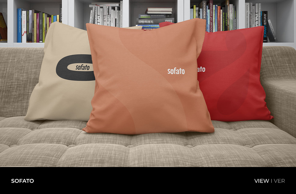
")

")

")